An office park in Warsaw, Poland houses the vibrant Coca-Cola HBC headquarters, designed by studio BIT CREATIVE. The eclectic mix of interiors celebrate the iconic company’s beverage brands, replete with the iconography and signature colors that are instantly recognizable around the globe.

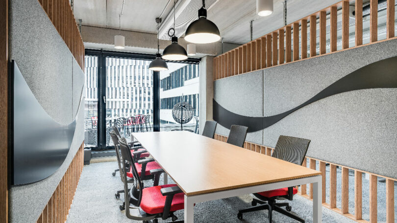
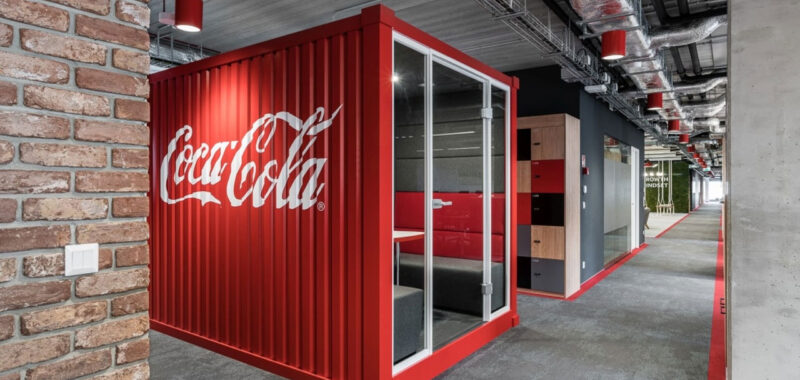
The headquarters boasts more than 59,000 square feet spread over three floors, housing up to 500 employees. Materials like oak wood and felt are paired with the rough brick and concrete, which softens the look of the industrial building. Yet for the designers, the manufacturer’s own fizzy color palettes were key to enhancing the overall look of the corporate space.


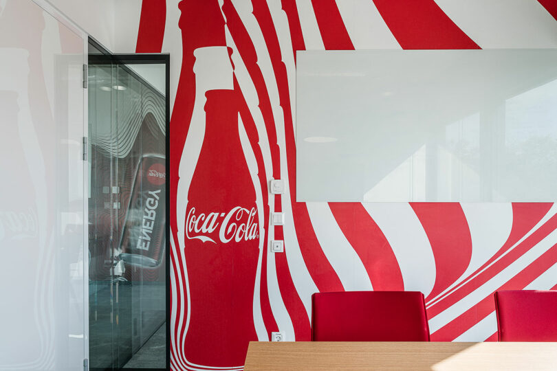
Coca-Cola’s red and white label was the logical starting point because of the familiar elements. However, the team was hesitant to blanket the space in the crimson hue, which can be perceived as harsh or aggressive, especially in a busy workplace. “We wanted to play with these details without overwhelming the employees,” says Jakub Bubel, an architect at BIT CREATIVE. “The wave of the logo allowed us to reference this brand and drink that everybody knows, in a delicate way.”


The architects also drew inspiration from the silhouette and the container itself. Filled bottles, for example, are embedded in the reception desk, and cabinets feature bottle-shaped handles. Other components of glass or plastic are often discarded, so they decided instead to incorporate them in creative ways – a win for people and the planet. The classic glass versions were made into light fixtures throughout the office. Everyday aluminum bottle caps, transformed into wall features and signage, add a whimsical touch.

It was a challenge to achieve the right balance in such an expansive, open-plan office. The goal was to create a welcoming environment, while reducing noise and maintaining privacy. Workstations are configured for a maximum of 12 people, fitted with simple partitions. Booths are the most popular furnishings with the employees, available in a variety of sizes. The larger structures clad with wood slats are called cottages. These spots allow individuals to enjoy quiet time during the busy workday.


There is no shortage of casual zones designed to promote relaxation and fun, too. Swings made of rope and wood planks are clustered near moss walls, bringing much needed greenery indoors. The kitchens on every floor (stocked with plenty of the company’s drinks) also have dining areas that double as places where people are encouraged to share a meal or touch base with co-workers.


The meeting rooms are the true highlight, each one decorated to reflect a particular brand. The Sprite room is decorated in citrusy, effervescent shades of lemon and lime. The Monster room, named after the energy drink, pulses with neon green racing stripes. Photos of skateboarders and BMX racers line the walls, and the showpiece table has two gleaming engines as a base. And the AdeZ room has a table attached to the ceiling. Corresponding images and shapes evoke beverages of choice in unique settings. “Whenever you are in the office, you feel the Coca-Cola, happy spirit,” Bubel notes.


To learn more more about this and other projects by BIT CREATIVE visit bitcreative.info.
Photography by BIT CREATIVE.

