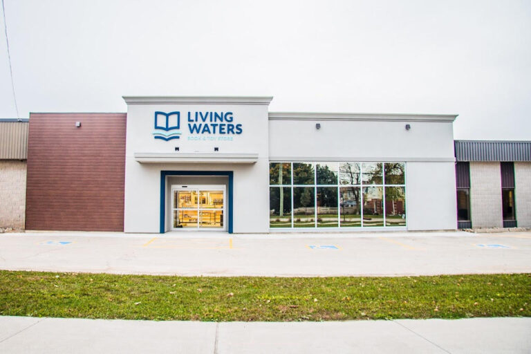
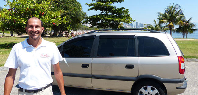
News Arts & Entertainment Chiara Rossetti Art: A Fusion of Passion, Creativity, and Innovation March 18, 2025 Automotive Ron Marhofer Cares Initiative Donates 100,000 Miles of Free Rides to Local Families and Veterans June 2, 2025 Books & Literature No post found! Building & Construction Sacramento Concrete Co. Announces Expanded Residential & Commercial Services to Meet Region’s Growing Demand for Quality Craftsmanship June 30, 2025 Business SpeedEFX Accelerates Vehicle Enhancement Experience in Centennial With Unified Paint Protection, Tint, and Wrap Solutions July 3, 2025 Cryptocurrency Wowbit Announces the Launch of Its Revolutionary Cryptocurrency Exchange June 1, 2024 Education Discover the Best of Johannesburg North with North Side Navigator February 9, 2025 Family & Parenting AE Psychotherapy Services: Guiding Individuals and Families Toward Resilience and Fulfillment January 1, 2025 Fashion & Beauty Work Attire Expert: Simplifying Workwear Choices for Everyday Professionals January 9, 2025 Finance Credifin Nederland BV introduceert maatwerk incassotrajecten met volledige transparantie en 100% No Cure No Pay-garantie May 27, 2025 Foreign Language Bijouterie Hidous : Luxe intemporel et bijoux personnalisés au cœur de Montréal March 2, 2025 Gov & Politics 'Hate speech is everywhere on X.' California Assembly Democrats leave Elon Musk's platform en masse March 27, 2025 Health & Fitness Rosebay Behavioral Health Opens Doors to Marin County’s First Dedicated Residential Program for High-Acuity Mental Health Care June 30, 2025 Home & Garden Ignite Landscapes Unveils “Outdoor Living Redefined” Initiative to Transform GTA Backyards Ahead of Summer 2025 June 30, 2025 Lifestyle Finding Clarity and Healing: Aim Point Counseling Offers Compassionate Support for Personal Growth March 18, 2025 Real Estate Unicorn Real Estate Launches “Swift‑Sell Solution” to Help Oklahoma City Homeowners Trade Stress for Certainty June 30, 2025 Religion Living Waters Book & Toy: A Beacon of Faith, Family, and Fun in Southern Ontario December 24, 2024 Science No post found! Sports No post found! Technology Apple Repair South Africa Delivers Trusted, Affordable Apple Device Repairs in the Heart of Bloemfontein June 3, 2025 Travel Explore the Wonders of Rio de Janeiro with a French-Speaking Guide March 11, 2025
Ron Marhofer Cares Initiative Donates 100,000 Miles of Free Rides to Local Families and Veterans June 2, 2025
Sacramento Concrete Co. Announces Expanded Residential & Commercial Services to Meet Region’s Growing Demand for Quality Craftsmanship June 30, 2025
SpeedEFX Accelerates Vehicle Enhancement Experience in Centennial With Unified Paint Protection, Tint, and Wrap Solutions July 3, 2025
AE Psychotherapy Services: Guiding Individuals and Families Toward Resilience and Fulfillment January 1, 2025
Credifin Nederland BV introduceert maatwerk incassotrajecten met volledige transparantie en 100% No Cure No Pay-garantie May 27, 2025
'Hate speech is everywhere on X.' California Assembly Democrats leave Elon Musk's platform en masse March 27, 2025
Rosebay Behavioral Health Opens Doors to Marin County’s First Dedicated Residential Program for High-Acuity Mental Health Care June 30, 2025
Ignite Landscapes Unveils “Outdoor Living Redefined” Initiative to Transform GTA Backyards Ahead of Summer 2025 June 30, 2025
Finding Clarity and Healing: Aim Point Counseling Offers Compassionate Support for Personal Growth March 18, 2025
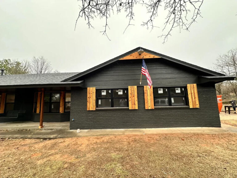
Unicorn Real Estate Launches “Swift‑Sell Solution” to Help Oklahoma City Homeowners Trade Stress for Certainty June 30, 2025
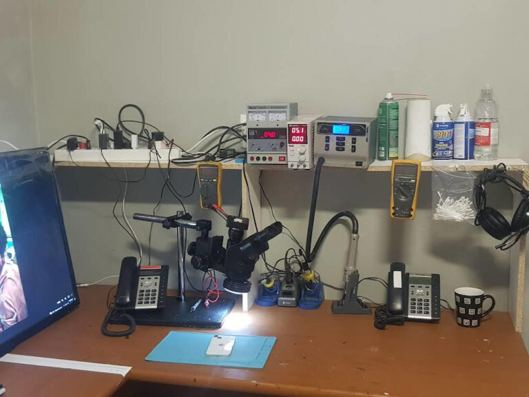
Apple Repair South Africa Delivers Trusted, Affordable Apple Device Repairs in the Heart of Bloemfontein June 3, 2025